
BUILDING A BETTER VAMPIRE
Posted on September 16, 2012
Below, Keith Robinson explains all the work he put into designing the cover to Norton the Vampire.
Take it away, Keith!
Here are a few layers to look at. It's a simplified snapshot but will give you a better idea of things.
The background is taken from the internet, resized to fit the cover, and colored red.
The monster has three layers – skin tones, scales, and outline – but each skin tone was constructed from several layers before merging into one, and the scales were pieced together from a single rectangular image copied multiple times (with each piece rotated and resized to better fit the monster's body, arm, etc). Once I had a monster-shaped montage of scales, I then made the layer semi-transparent so the skin tones bled through, and then faded out the scales in certain places so it wasn't so uniform, just a subtle hint.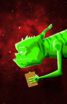
I actually dealt with the monster's arm separately, on a different layer, because it needed its own shading. When I was happy with it, I merged the arm with the body and blended the shoulder into the body.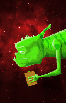
Norton was easier. It was the same process with the skin tones, eventually merged into one single layer and the outline added back in over the top. Some of his shadowed areas (notably the front of his shirt and around the life ring) were done by marking around the area I wanted to shadow, adding a bit of "feather" to blend it in, and then using the "brightness" tool to darken the selected area. This darkens the white and red colors equally so that the overall effect is a realistic shadow.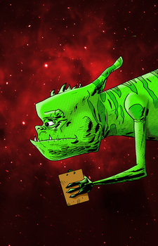
I used this same darkening technique on each stripe on the monster's back. It works better than just using one solid color to paint or fill the blotches. This way the stripes darken as necessary with the varying tones of the skin.
Both Norton and the monster have a glow. I did this by copying both characters, turning them completely white, and placing those solid white shapes behind the colored characters so those white layers are completely lined up and hidden. Then I blurred the white shapes so they kind of fuzzed outwards to create a glow. This ended up a little too bright so I made them slightly transparent to fade them out a little.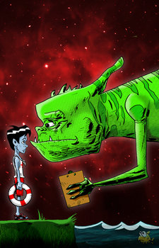
The grassy area has a semi-transparent layer of real grass overlaid, and then I darkened parts of it. Likewise, the water has an actual underwater image overlaid, again semi-transparent. The fish is a separate layer also, placed on top but then made a little transparent so he blends better into the water.
The titles were added last – just a couple of fonts with a bit of drop-shadow behind them.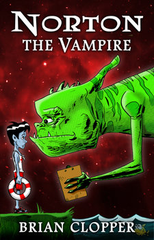
I was blown away by his color work and lovely design. He is amazingly talented with his own art. And students in my class know how much I dig his writing. Keith's Island of Fog series is a must read for anyone wanting a great escape into an apocalyptic fantasy scenario. Not many writers could pull that off and Keith does with charm, class and style.
By the way, one thing I noticed about this cover: I draw a mean clipboard. There should be some sort of award for that, right?