
WILL A NEW COVER MAKE ZOMBIE FANS SHAMBLE OUT TO GRAB MY TURNCOATS BOOK?
Posted on September 24, 2012
I was having second thoughts about my cover to my zombie series, Turncoats. I found the image appealing, but a little too vague. The title was also not screaming zombie. When I mentioned this to my writer friend, Keith Robinson, he mentioned that the title of the first book, Overrun, was better for indicating zombies. He worked up a mock cover with a new logo, and I immediately knew I needed a new image for the book.
A major scenic element in the series is the fact that several scenes happen in a large ravine of kudzu. I thought it would make sense to have a zombie hand thrusting out of the leafy canopy of the South's most despicable invasive plant. I took my kids out to the woods and had them take shots of me with my hand poking through the pesky and itchy vines. Below are the initial photos I sent Keith: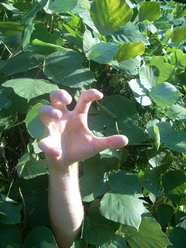
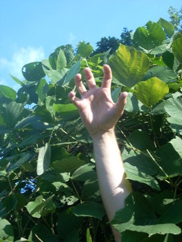
The image with the sky in the background was my favorite, but Keith said the hand was too blurry and the sky was too cheery. He worked with the image that had my hand thrusting forward and lots of leafy foliage behind it.
A few days later, Keith sent the image below: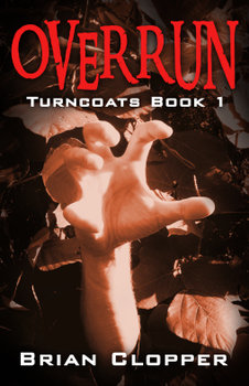
I loved it. He indicated he would zombify it up and send me a far creepier version soon. I was on the edge of my seat, waiting to see what coolness he would concoct.
A few days later, he sent this: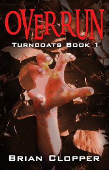
Now I loved the veins, the dirt and patterns he laid over it. I asked him to take out the yellow and to back down the fingernails so they weren't glowing. A few hours later, he sent me the wonderful piece that is now the cover.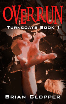
I can't say enough how excited it makes me whenever I open up my email and see another cover done up nice by Keith Robinson. He is always amazing me. The font he chose is just so good and the tinting and color contrast he achieved in the piece puts it at such another level. I am hopeful that this new cover will get the book in front of even more hungry eyes.