COVER DESIGN PROCESS WITH HUMOR
Posted on July 30, 2017
My design skills just don't cut it anymore, but I am so fortunate to have a fellow writer who I work closely with who has designed all my covers. He recently worked his magic on Ghost Coast, and I thought it would be fun to show you the creative and often silly back and forth we engage in when we collaborate. We are snarky to each other when we edit and revise each other's work as well.
A big thank you to Keith Robinson for always delivering such great covers.
Photo Inspiration
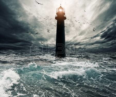
I combed through several stock photo sights looking for ocean storms and ghosts. I found too many creepy ghost girls. I selected the girl below just as a placeholder. She looked too posed and clean cut for the cover. I found the great lighthouse in the ocean photo and had just written a lighthouse scene a week earlier. Having it placed in the middle of the water with no evidence of land wasn't something I hadn't done in the original story. But given how the lighthouse figures into the story, having it appear without any land made perfect sense and made the story a little more unearthly.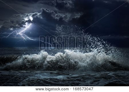

Three Fading Girls
Keith sent me three versions of the cover with a different girl that looked less posed. He faded her different in each to giver her a spectral quality.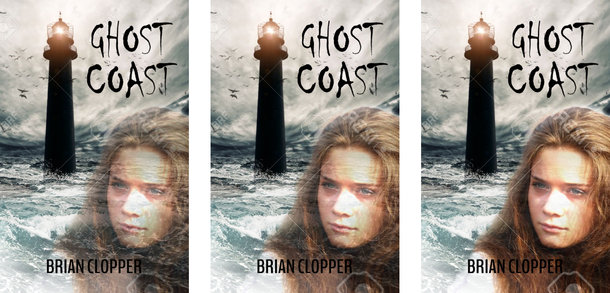
I liked the lighthouse image, but the girl wasn't quite there for me yet. Keith asked if my intention was to have the book appear as a ghostly romance. Once he asked that, the girl on the cover was starting to sour for me. The story is more of a adventure like The Goonies. I asked him to change the font to something vertical and Gothic as I have never liked the Chiller font. I also requested a blue glow around the ghost girl.
Sneaking In The Silly
Along with the three images from earlier, Keith also sent me these goofy covers. They really had me cracking up, and my daughter loved the toast one.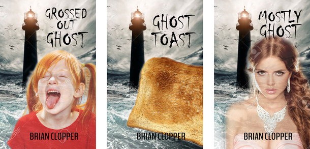
Glowing Girl
Keith gave me a different girl with a glow and a different font.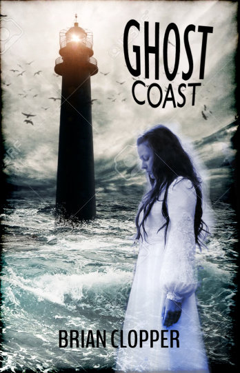
With this cover, I realized the ghost girl was working against the feel of the book. I asked Keith to just focus on the lighthouse image and maybe see it through the window of the letters in the title like he'd done with the We Kill Humans cover.
Clarity Wins Out In The End
He discouraged me from going with the letters as windows and presented the following cover: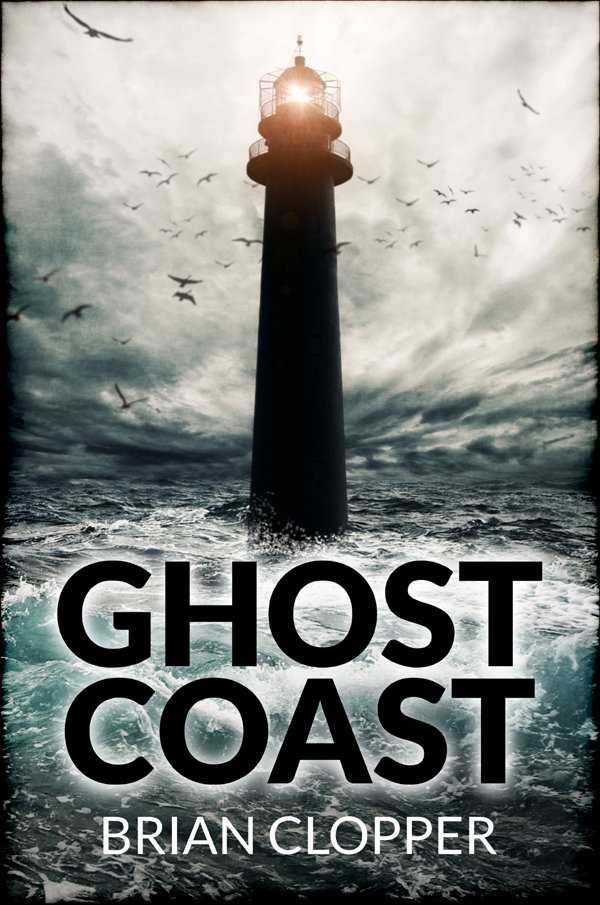
He had it. I loved this version. The black letters with the white glow were quite ghostly and the lighthouse image really gave off a supernatural vibe. The cover became about the setting and no longer dripped with ectoplasmic romance. Thank goodness for that.
Thanks again, Keith. Your covers always surpass what's in my head. I can't wait to see what you do with the cover to my next book.