Get your FREE Starter Library (three completely free full-length novels)
BATS AND A BRANCH
Posted on September 7, 2012
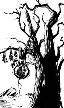
Okay, here's another stab at the cover. I got inspired and decided to have Norton hanging upside down from a branch with a life preserve around his neck while a bat family, the Stumblepots, look at him with dismay.
Hoping to tighten it up and really play with more trees in the background as a bit of faded shadows.
IF YOU LIKED THIS POST, PLEASE SHARE IT AROUND...
Comment by KEITH ROBINSON on SATURDAY, SEPTEMBER 8, 2012...
Love it! While you're working on it, give some thought to the positioning of the title text and author name, as well as the backdrop. There's plenty of space for the title and author name in this example, so no problem there, so just think about the backdrop, ie, the shading and coloring. For instance, if the background is really pale and light, you could use very dark text. But your tree is dark and I suspect your background will be too, so the text will probably end up being white or very pale with drop shadow to make it stand out. You have to consider that this white text (especially the author name) will straddle the tree trunk at the bottom, meaning you'll have white text over a very dark tree trunk on the right (good) and also over the "ground" area beyond the tree on the left (fine if the ground area is shaded/colored fairly dark as well).
I have a feeling this image will be very dark in general though, since it's at night — so all dark blues or purples or something? That will work great, and the text can be white, yellow, or some other color that is perhaps picked up in the image somewhere, like the color of his life preserve ring thing.
Also, think about the overall shape/proportions and try to get it with the same aspect ratio as the printed book. I'm sure you've given ALL this stuff thought already, but I know it's easy to forget when getting carried away with sketching...
Post a comment...
All recent posts and archives...
February 2025
January 2025
December 2024
November 2024
October 2024
July 2024
March 2024
February 2024
January 2024
August 2023
July 2023
June 2023
May 2023
April 2023
January 2023
December 2022
November 2022
August 2022
June 2022
May 2022
January 2022
December 2021
November 2021
August 2021
July 2021
June 2021
April 2021
March 2021
February 2021
January 2021
December 2020
November 2020
October 2020
August 2020
July 2020
June 2020
May 2020
April 2020
March 2020
December 2019
November 2019
August 2019
July 2019
June 2019
May 2019
April 2019
March 2019
February 2019
January 2019
December 2018
November 2018
October 2018
September 2018
August 2018
July 2018
June 2018
May 2018
April 2018
March 2018
February 2018
January 2018
December 2017
November 2017
October 2017
August 2017
July 2017
June 2017
May 2017
April 2017
March 2017
February 2017
January 2017
December 2016
November 2016
October 2016
September 2016
August 2016
July 2016
April 2016
March 2016
February 2016
January 2016
December 2015
November 2015
October 2015
July 2015
June 2015
May 2015
April 2015
March 2015
February 2015
January 2015
December 2014
November 2014
September 2014
August 2014
July 2014
June 2014
May 2014
April 2014
March 2014
February 2014
January 2014
December 2013
November 2013
October 2013
September 2013
August 2013
July 2013
June 2013
May 2013
April 2013
March 2013
February 2013
January 2013
December 2012
November 2012
October 2012
September 2012
August 2012
July 2012
June 2012
May 2012
April 2012
March 2012
January 2012
November 2011
October 2011
September 2011
August 2011
